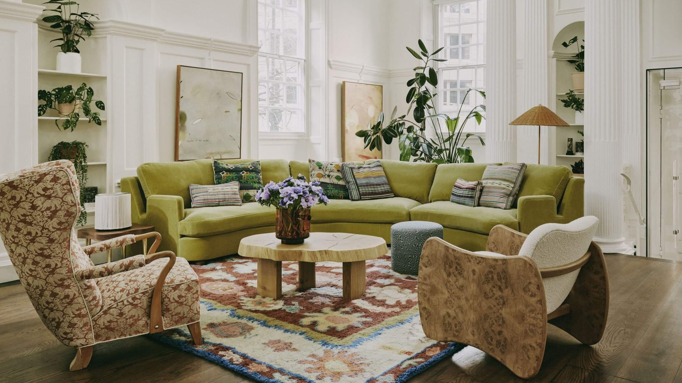
Mixing Prints and Patterns Without Creating Chaos
Prints and patterns bring energy, character, and personality into a home. From florals and stripes to geometrics and tribal motifs, they add depth and visual intrigue to any space. But mixing them? That can feel intimidating. Do too little and it looks plain—do too much and it feels chaotic.
Recent Blogs
- 10 Stunning Living Room Ideas That Feel Like Home
- 5 Tips and Tricks for the Aspiring Fashionista
- Top 7 Anti-Aging Ingredients to Look For
- Must-Have Fitness Gear For Smarter Health And Stronger Results
- The Importance of Recovery Days in Your Fitness Routine
- Your Guide to Understanding Skin Types and Choosing Products
- How to Protect Your Gym Floors (and Why Most People Get It Wrong)
September 25 02
Introduction
Prints and patterns bring energy, character, and personality into a home. From florals and stripes to geometrics and tribal motifs, they add depth and visual intrigue to any space. But mixing them? That can feel intimidating. Do too little and it looks plain—do too much and it feels chaotic.
The secret lies in understanding how to layer different patterns with balance and intention. In this blog, we’ll explore how to confidently mix prints and patterns across textiles, wallpapers, rugs, and decor without sacrificing style or cohesion.
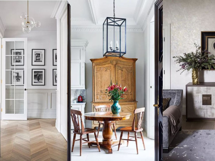
1. Start with a Dominant Pattern
Choose one standout pattern that will set the tone for your space. This could be:
- A floral wallpaper
- A bold rug
- A large-scale geometric curtain
- An oversized patterned sofa
This dominant pattern will act as your anchor, around which all other designs revolve. Make sure it reflects the vibe you want—elegant, playful, boho, or modern.
2. Stick to a Consistent Color Palette
To avoid visual overload, unify different patterns through color.
Tips:
- Choose 2–3 main colors and keep all patterns within that palette
- Vary intensity—some patterns can be bolder, others more muted
- Use neutrals (white, beige, gray) as a base to tone down busy designs
When patterns share a color story, they feel cohesive—even if they’re very different in style.
3. Vary the Scale of Patterns
Combining patterns of different sizes helps create contrast without clutter.
A balanced mix might include:
- One large-scale pattern (like a rug or duvet)
- One medium-scale pattern (like curtains or accent chairs)
- One small-scale pattern (like cushions or throws)
This hierarchy allows each pattern to stand out while complementing the others. Avoid using several prints of the same size—they tend to compete rather than cooperate.
4. Combine Different Pattern Types
Mixing different types of patterns makes your decor more layered and interesting.
Try blending:
- Organic patterns (like florals, leaves, or paisleys)
- Structured patterns (like stripes, plaids, or grids)
- Abstract or tribal motifs for texture and variety
For example, pair a botanical wallpaper with a striped chair and a dotted cushion. When done right, this creates rhythmic contrast and rich visual texture.
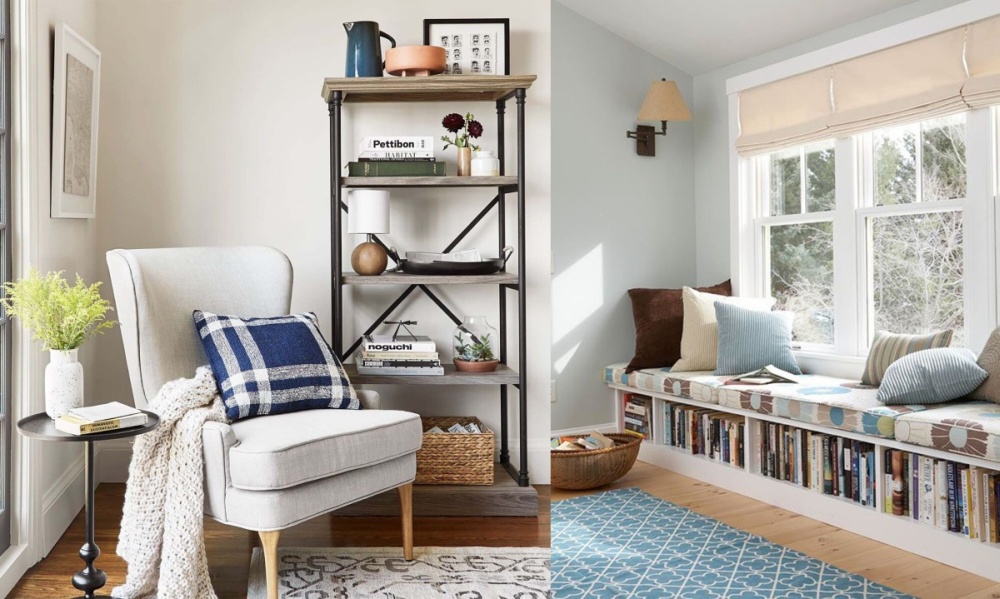
5. Use Solids and Neutrals to Ground the Look
To give the eye a place to rest, incorporate solid-colored pieces in between patterns.
Ideas:
- A plain sofa between printed cushions
- Neutral curtains framing patterned wallpaper
- A solid bedspread with a patterned headboard and pillows
These “breathing spaces” prevent visual fatigue and keep the decor anchored and elegant.
6. Repeat Key Motifs or Colors for Unity
Even if your patterns differ in style or origin, you can tie them together by repeating elements.
Examples:
- Repeat a particular color in multiple patterns
- Echo a shape (like circles, leaves, or diamonds) across different textiles
- Match pattern intensity (e.g., all soft and faded vs. all bold and graphic)
Repetition builds rhythm and ensures that all elements feel part of the same story.
7. Start Small in Low-Risk Zones
If you’re hesitant to go bold, begin your pattern journey in smaller or less permanent areas.
Perfect places to experiment:
- Throw pillows or blankets
- Lampshades or upholstered stools
- Wall art or framed fabric prints
- Small rugs or poufs
These accents allow you to test combinations without a big commitment—and you can swap them out seasonally or as your style evolves.
8. Use Patterns to Define Zones
In open-plan spaces, patterns can help visually divide areas.
For instance:
- A patterned rug under the dining table
- A bold wallpaper behind your desk nook
- Contrasting cushions on different seating groups
This not only looks dynamic, but it also creates structure and clarity in multi-use spaces.
9. Break Up Busy Areas with White Space
Too many patterns packed tightly can feel overwhelming. Leave white space or empty zones to give your patterns room to breathe.
Tips:
- Avoid placing patterned items directly next to each other
- Use plain walls, furniture, or floors to interrupt print-heavy zones
- Limit the number of patterns in one visual field
This creates a sense of order and makes each pattern feel purposeful, not chaotic.
10. Trust Your Eye and Edit Ruthlessly
There are guidelines—but ultimately, trust what feels right to you.
- Step back often to see how the mix looks from a distance
- Rearrange items until the space feels balanced
- Don’t be afraid to remove a pattern if it disrupts harmony
- Let your taste lead the way—your home should reflect your style, not rules
Over time, you’ll develop an instinct for what works together and what doesn’t.
Conclusion
Mixing prints and patterns is one of the most expressive ways to bring life and individuality into your home. With the right balance of scale, color, and contrast, you can transform any space into a dynamic, layered, and deeply personal environment.
Remember: it’s not about perfection—it’s about confidence, curiosity, and creativity. So go ahead—mix those florals with stripes, pair the checks with botanicals, and let your decor tell a bold, beautiful story.
Comment:
Your email address will not be published. Required fields are marked *


You Might Also Like