Creating Calm with Color: A Guide to Soothing Palettes
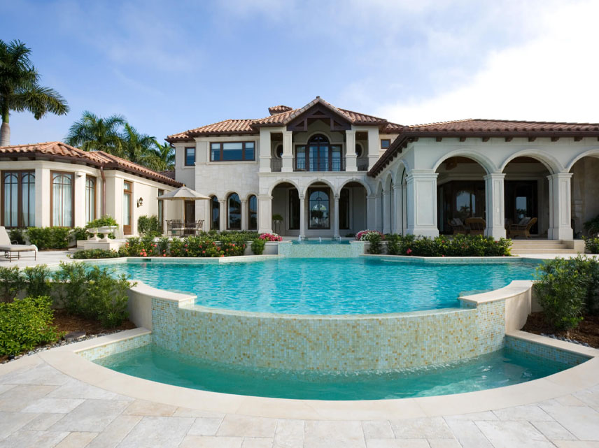
Color has the power to shape how we feel—calming the mind, easing tension, and setting the tone for rest or reflection. When chosen intentionally, your home’s color palette can become a silent source of comfort and emotional support.
Recent Blogs
- How to Choose the Best Electric Bike for Long Beach Rides and Outdoor Adventures
- Natural Remedies for Glowing Skin at Home
- How to Protect Your Gym Floors (and Why Most People Get It Wrong)
- The Importance of Recovery Days in Your Fitness Routine
- Creating Calm with Color: A Guide to Soothing Palettes
- The Connection Between Sleep and Beauty
- What Are the Must-Have Fashion Trends for This Season?
September 25 02
Introduction
Color has the power to shape how we feel—calming the mind, easing tension, and setting the tone for rest or reflection. When chosen intentionally, your home’s color palette can become a silent source of comfort and emotional support. Whether you're designing a retreat-like bedroom or a peaceful living space, the right hues can instantly create a sense of calm.
In this blog, we’ll explore how to use color thoughtfully to craft soothing interiors. From soft neutrals to serene blues and greens, you’ll discover palette ideas and design tips that help you bring peace and quiet into your everyday environment.
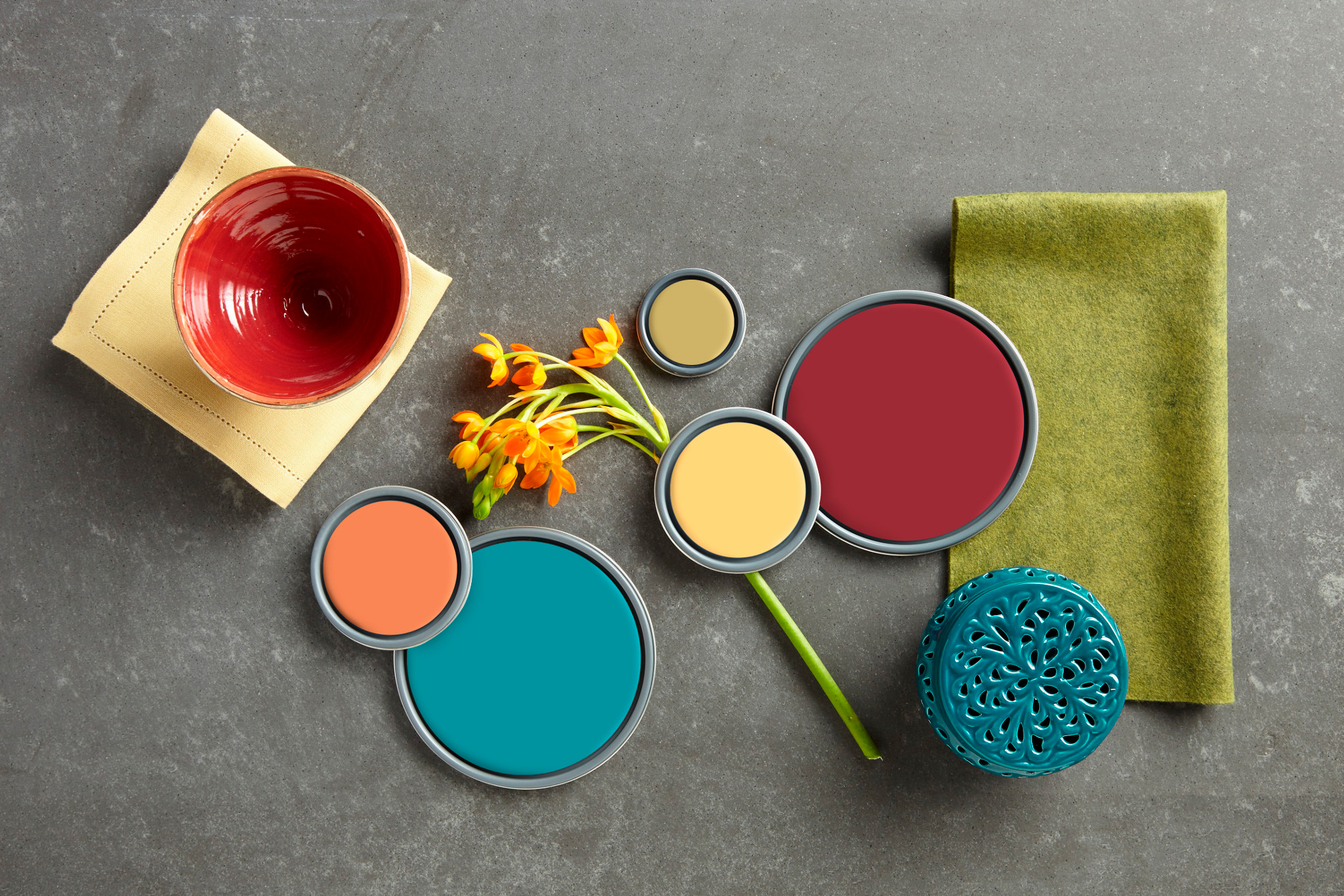
1. Understand the Psychology of Color
Different colors evoke different emotions. To create calm, you’ll want to lean into hues that are gentle, muted, and low in saturation.
Soothing color associations:
- Blue: Tranquility, clarity, restfulness
- Green: Balance, renewal, nature
- Lavender: Serenity, lightness, subtle elegance
- Beige and taupe: Warmth, comfort, timelessness
- Soft gray: Sophistication, stillness, modern calm
- Pale pinks or blush: Tenderness, softness, gentle energy
Stick to cooler or neutral tones for the most serene effect.
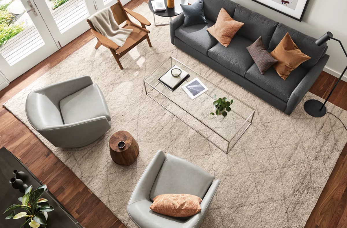
2. Build a Tonal Palette with Variations of One Hue
One of the most calming approaches is to use a monochromatic palette—different shades of the same color.
Examples:
- A room in layered soft blues: sky blue walls, navy accents, and powder blue textiles
- A green palette using sage, olive, and moss
- Warm neutrals like cream, camel, and sand
This approach adds depth while maintaining a continuous visual rhythm.
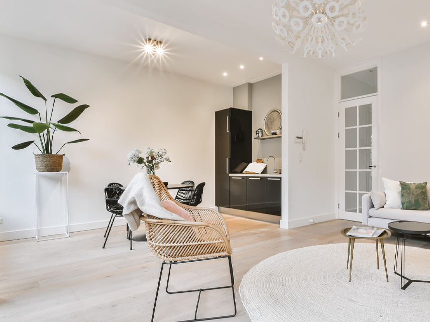
3. Add White and Natural Tones for Breathability
In calm spaces, visual lightness is key. Break up your palette with airy whites or soft off-whites.
Try:
- Crisp white trim or ceilings
- Light oak or birch wood for warmth
- Neutral upholstery or curtains to balance deeper hues
Natural tones and whites help your space breathe visually, reducing heaviness and increasing lightness.
4. Choose Matte and Muted Finishes
High-gloss or saturated finishes can feel sharp or overstimulating. Instead, opt for matte, chalky, or eggshell finishes that absorb light softly.
Good materials for calm:
- Limewashed or flat-painted walls
- Textured wallpapers in linen or grasscloth
- Upholstery in velvet, cotton, or boucle
- Ceramics with matte glazes
These finishes soothe both the eye and the touch.
5. Anchor with Cool Blues and Greens
When in doubt, blue and green are universal calming colors. Their connection to water, sky, and nature makes them ideal for tranquil interiors.
Ideas:
- Soft teal or powder blue for bathrooms or bedrooms
- Sage green or muted olive for living rooms and kitchens
- Seafoam, mint, or eucalyptus tones for a fresh, gentle feel
These shades work beautifully across styles—from modern to traditional.
6. Don’t Be Afraid of Warmth—Use It Wisely
While cool tones dominate calm palettes, warm hues can also soothe if used in muted or earthy tones.
Calming warm colors:
- Terracotta or clay
- Soft peach or blush
- Pale buttery yellows
- Warm beige or oatmeal
Balance them with white or gray to keep the palette from becoming too heavy or stimulating.
7. Incorporate Color Through Layers, Not Just Walls
Color doesn’t have to be painted on the walls—it can be layered in subtle, movable ways.
Try:
- Throws and cushions in calming shades
- Light-toned area rugs or bedding
- Soft-colored ceramics, books, or drapery
- Art or prints in muted, monochrome styles
Layering color this way allows you to experiment and adjust the mood seasonally.
8. Limit High-Contrast Pairings
Contrast adds energy—but too much can disrupt calm.
Instead:
- Blend tones of similar depth and temperature
- Avoid sharp black-and-white pairings in restful areas
- Use contrast sparingly to highlight rather than dominate
This creates a gentler flow for the eye and the mind.
9. Use Color to Support Room Function
Different rooms have different emotional needs. Choose palettes that match the intended mood.
Examples:
- Bedroom: Soft gray, dusty blue, or lavender for rest
- Living room: Muted greens, warm taupe, or beige for comfort
- Bathroom: Seafoam, white, or pale blue for refreshment
- Workspace: Light sage or sky blue for focus without tension
This room-by-room approach helps create a cohesive, emotionally aligned home.
10. Let Nature Guide Your Palette
Nature is the original mood master. Look to natural landscapes for inspiration:
- Forest tones: moss, bark, fog
- Coastal hues: sea glass, sand, driftwood
- Desert shades: terracotta, blush rock, sagebrush
- Cloudy skies: silver, soft blue, warm gray
These palettes feel instinctively calming because they mirror places of stillness and reflection.
Conclusion
Creating calm with color is about more than aesthetic—it's about how your home supports your emotional well-being. By choosing soft, harmonious hues and layering them intentionally, you can design spaces that nurture peace, focus, and relaxation.
Whether you're updating a single room or rethinking your whole palette, let your intuition and the feeling you want to create lead the way.
Comment:
Your email address will not be published. Required fields are marked *


You Might Also Like