Creating a Cohesive Color Palette for Your Entire Home
Color is one of the most powerful tools in interior design. It sets the mood, reflects your personality, and shapes how spaces feel and flow together.
Recent Blogs
- How to Protect Your Gym Floors (and Why Most People Get It Wrong)
- Best Skincare Routine for Dry Skin
- How to Choose the Perfect Travel Backpack for Every Type of Trip
- Post-Workout Nutrition: How to Recover Right
- How AI Is Transforming Consumer Tech in 2025
- 10 Best Portable Travel Projectors for Movie Nights Anywhere in 2025
- Top 10 Smartwatches of 2025 for Fitness, Productivity, and Style
September 25 01
Introduction
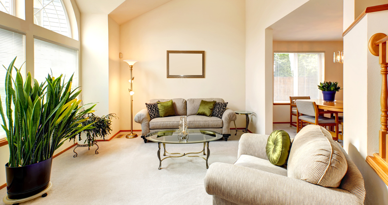
Color is one of the most powerful tools in interior design. It sets the mood, reflects your personality, and shapes how spaces feel and flow together. But when different rooms in your home clash or feel disconnected, the overall experience can become jarring. The solution? A cohesive color palette.
Designing with a unified color scheme doesn’t mean every room has to be the same. Instead, it’s about creating visual harmony—a seamless transition of tones and textures that brings calm, balance, and beauty to your space. In this blog, we’ll show you how to build a whole-home color palette that feels intentional, stylish, and totally livable.
1. Start with Inspiration and Emotion
Before choosing colors, consider what mood or vibe you want your home to evoke.
Ask yourself:
- Do you want your home to feel cozy, airy, calm, bold, or refreshing?
- Are you drawn to warm or cool tones?
- Is there a place, season, or piece of art that inspires you?
This emotional starting point will help you define your palette’s purpose, not just its appearance.
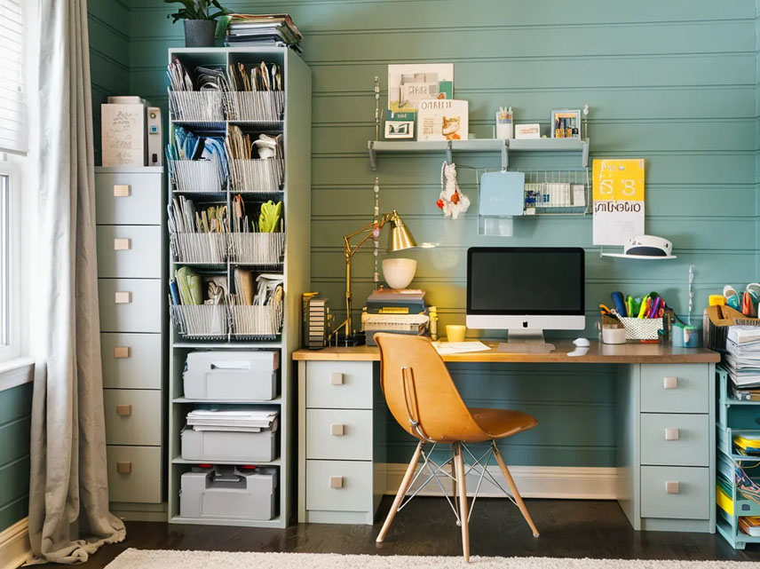
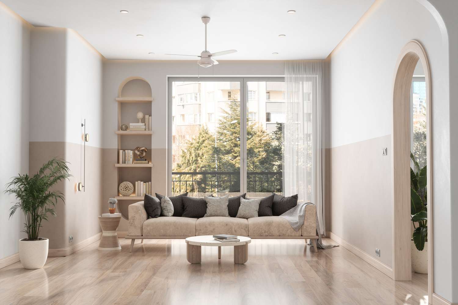
2. Choose a Base Neutral Color
A strong base neutral serves as the foundation of your palette, offering consistency and flexibility.
Popular base neutrals:
- White or off-white for brightness
- Soft beige or greige for warmth
- Light gray for modern simplicity
- Warm taupe or ivory for coziness
This base can be used on walls, large furniture, and trim across the home to unify your spaces.
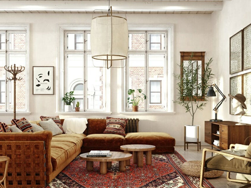
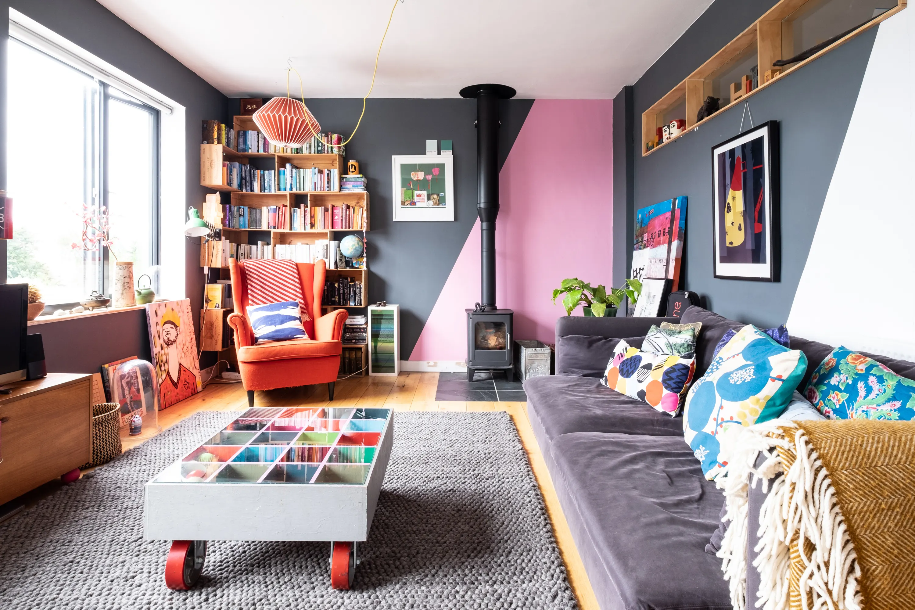
3. Add 2–3 Complementary Colors
Once your base is set, select two or three additional hues that work well with it. These should complement each other and offer variety while maintaining a consistent look.
Tips:
- Choose one dominant color, one secondary, and one accent
- Stick within the same undertone family (cool or warm)
- Pull shades from nature or existing elements in your home (like flooring or countertops)
This trio will act as your main toolkit for building out each room with style and balance.
4. Use the 60-30-10 Rule
This tried-and-true design formula helps you balance your color palette throughout your home.
- 60%: Your base color—walls, larger furniture, flooring
- 30%: Your secondary color—curtains, rugs, bedding
- 10%: Your accent color—pillows, art, accessories
Applying this ratio ensures rooms feel balanced and not overwhelmed by any one tone.
5. Create Flow with Gradual Transitions
To avoid a “patchwork” feel, design your palette with intentional shifts between rooms.
Ideas:
- Use slightly darker or lighter versions of the same hue in adjacent spaces
- Repeat certain accent colors throughout the home
- Keep trim and ceiling colors consistent for unity
- Use rugs, throws, and art to subtly bridge color changes
This keeps your home feeling connected rather than compartmentalized.
6. Anchor Open Spaces with Consistent Colors
In open-concept homes, color cohesion is especially important. The eye can take in multiple areas at once, so tones should relate and blend.
Tips:
- Use the same wall color throughout shared spaces
- Tie rooms together with consistent materials or finishes
- Repeat patterns or textiles that echo your core palette
- Avoid sharp contrasts between adjoining zones
Consistency in open spaces maintains harmony and sophistication.
7. Don’t Forget Texture and Finish
Color is affected by light, material, and texture. Matte paint absorbs light, while satin or gloss reflects it; natural fabrics dull tones while metallic finishes amplify them.
Incorporate texture through:
- Woven rugs or baskets
- Wood, stone, or leather elements
- Velvet, linen, or boucle upholstery
- Matte vs. glossy paint or tile finishes
This layered approach adds depth and richness to your palette.
8. Use Accent Colors Purposefully
Accent colors are where you can play—but they should still feel cohesive.
Tips:
- Choose accents that contrast or pop against your base and secondary colors
- Use them sparingly to highlight architectural features or decor
- Carry the same accent color in small doses throughout different rooms
This creates moments of visual interest without overwhelming the design flow.
9. Sample Before Committing
Paint and fabric swatches can look different in every room. Always test colors in natural and artificial light to see how they behave.
Do this:
- Paint large swatches on different walls
- Observe them at different times of day
- Compare next to furniture, floors, and lighting
Taking time to test ensures your palette works in context, not just in theory.
10. Trust Your Eye—Not Just the Trends
Trendy colors may look great online, but your home should reflect your taste and lifestyle.
- Choose colors you won’t tire of quickly
- Let your personality shine through favorite hues
- Blend timeless base colors with modern accents for flexibility
- Prioritize comfort over hype
A cohesive color palette that feels like you will always be in style.
Conclusion
Creating a cohesive color palette for your entire home is more than just a design exercise—it’s a way to bring peace, unity, and visual pleasure into your everyday life. With the right base, a few thoughtful tones, and a balance of texture and flow, your home can feel connected, curated, and effortlessly stylish from room to room.
So take your time, trust your instincts, and remember: color isn’t just what you see—it’s what you feel.
Comment:
Your email address will not be published. Required fields are marked *


You Might Also Like